
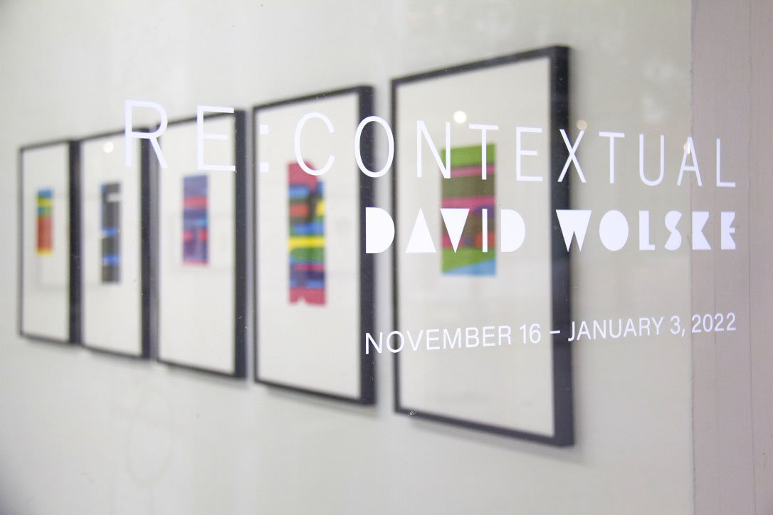
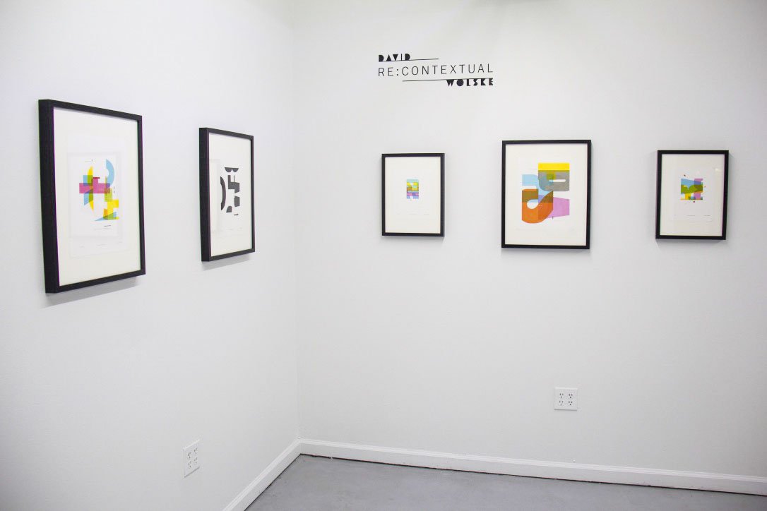
A Closer Look: Re:Contextual by David Wolske
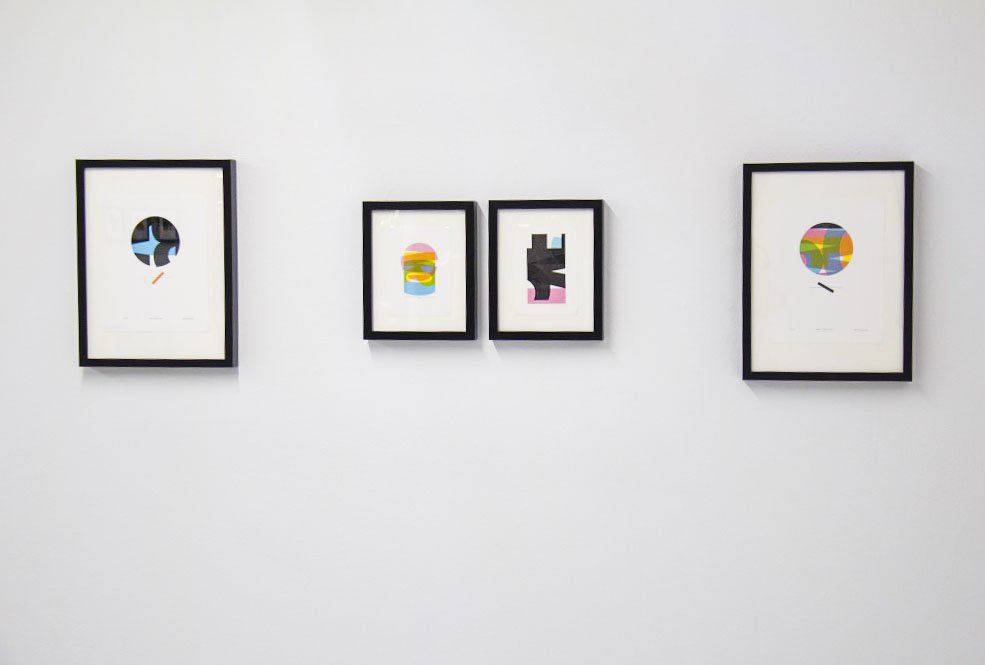
Re:Contextual is a solo exhibition by David Wolske combining contemporary and historical processes to transfigure letters, numbers, and punctuation into visual poetry. Within the gallery hangs a series of letterpress prints showcasing enigmatic compositions of deceptively simple shapes, which viewers may be surprised to learn are remixed from wood and metal type. The playful abstractions use color and negative space to communicate the more emotional aspects of written language while inviting the viewers to create their own interpretations.
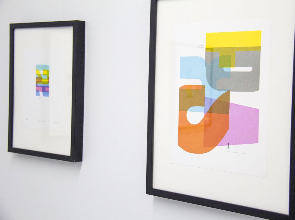
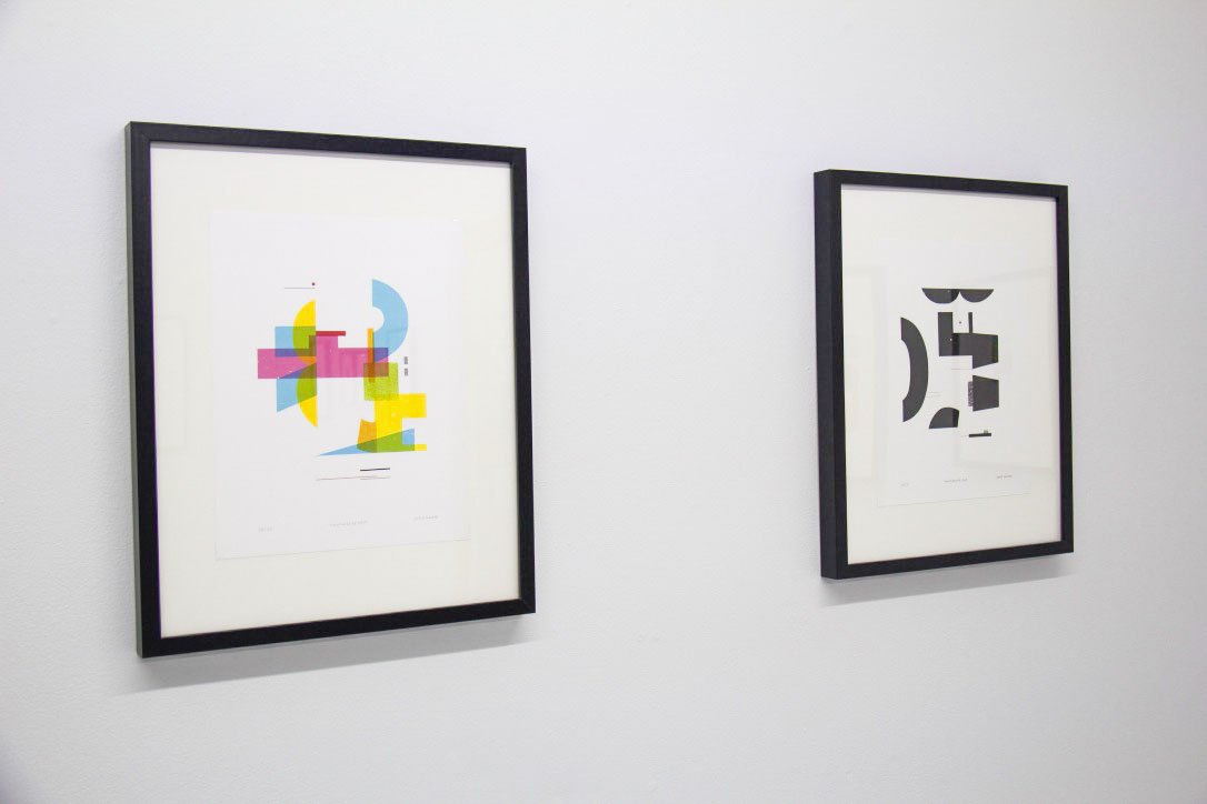
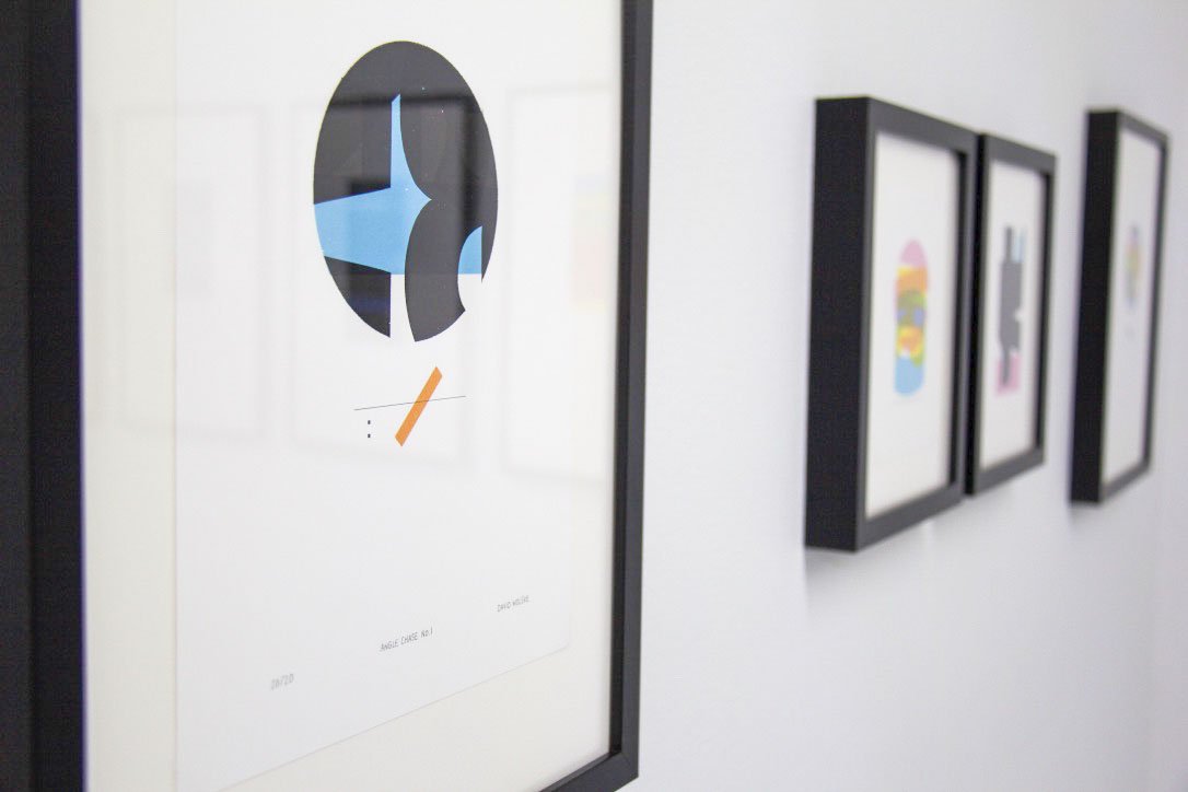
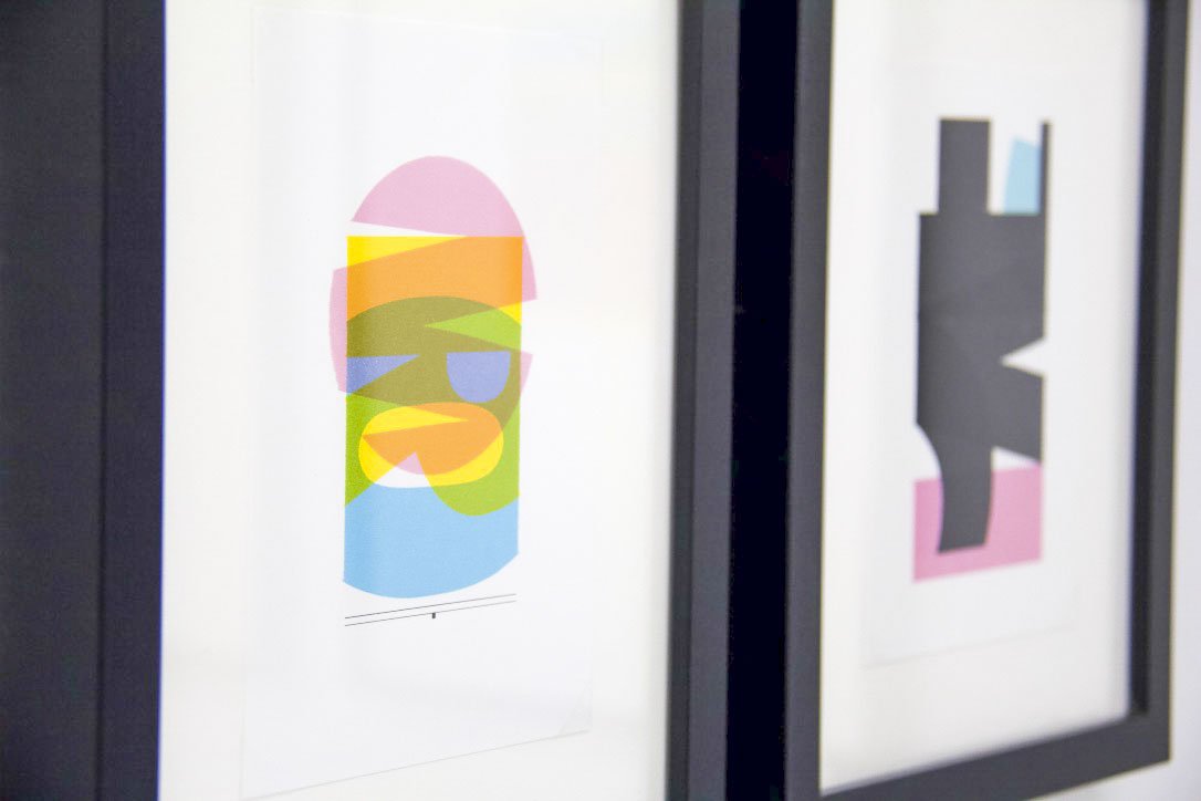
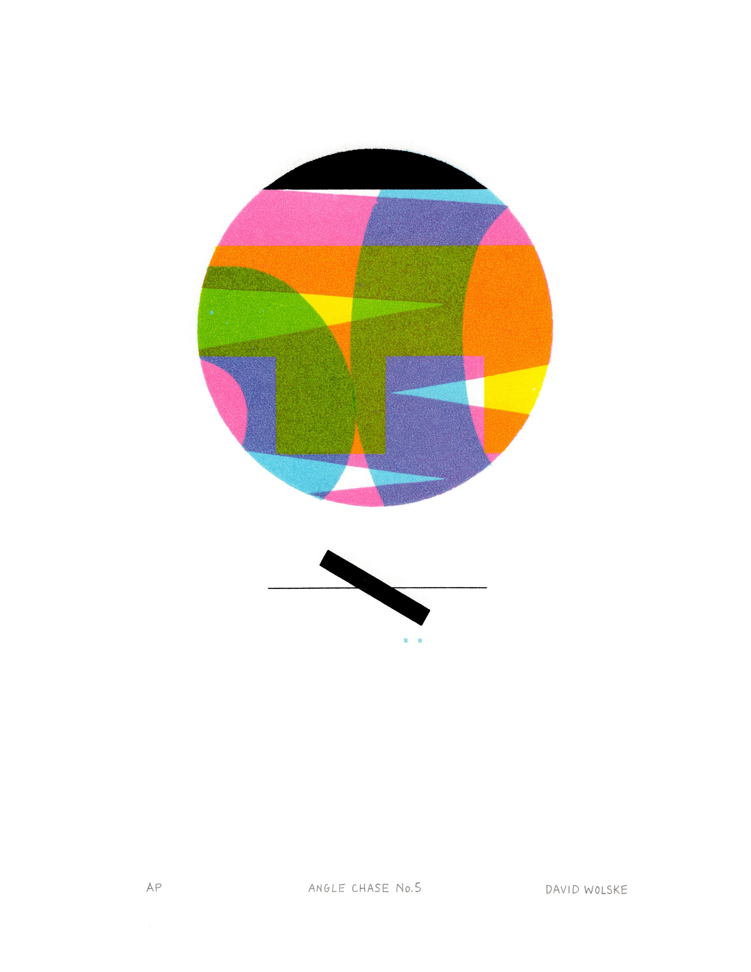
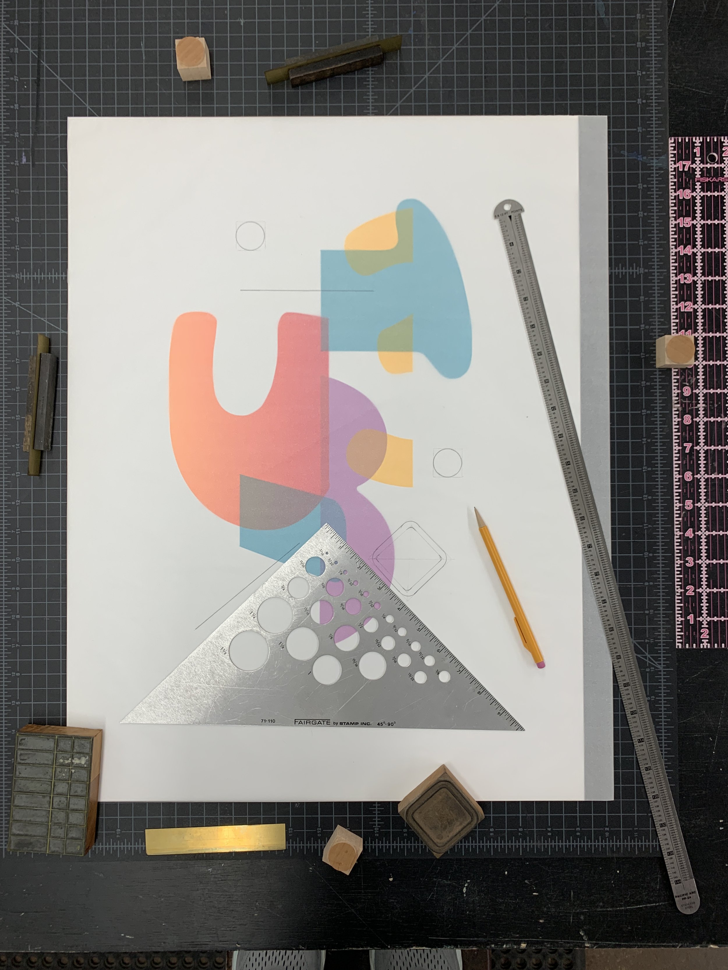
By deconstructing language to express a more visceral form of communication, Wolske's work playfully subverts the relationship between the hand and the machine. This distinctive method of subtractive letterpress printing was born out of a significant discovery for the artist in 2012. He found that if he used a series of masks and accounted for precise pressure while printing, he was able to isolate and therefore, abstract sections of type. Thus, he coined his technique, ‘Isotype printing’. Wolske elaborates, “I acknowledge that I’m appropriating the word Isotype, which already exists. I’m using it as a combination of the word isolate and type, because that’s exactly what I’m doing. I’m isolating atomic elements of the letterforms, looking for those vertical, horizontal, and diagonal curved lines. I want to isolate them and mask them, which the technique allows me to do.”

During his artist talk at the preview reception for his show during Small Press Fair ‘21, we learned that Wolske’s work thrives under creative limitations. “Whether wearing my artist hat or graphic design hat, all my work begins by defining some parameters for limitations. This helps me overcome the creative paralysis that results from the proverbial blank canvas. By limiting my choice of letters and wood type blocks, limiting my color palette and paper size, I can focus my creative energy on exploring compositional iterations. I get the most artistic joy and fulfilment from discovering new combinations from the same elements. Much like all of western music uses just twelve tones, I find an infinite variety possible in such a creative framework endlessly inspiring.”
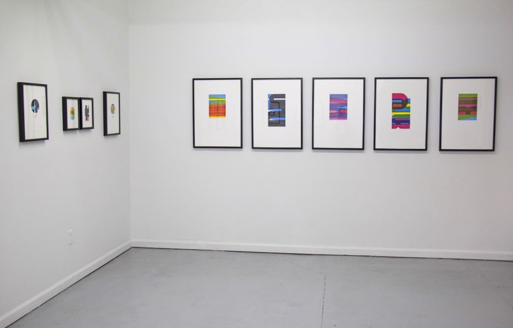
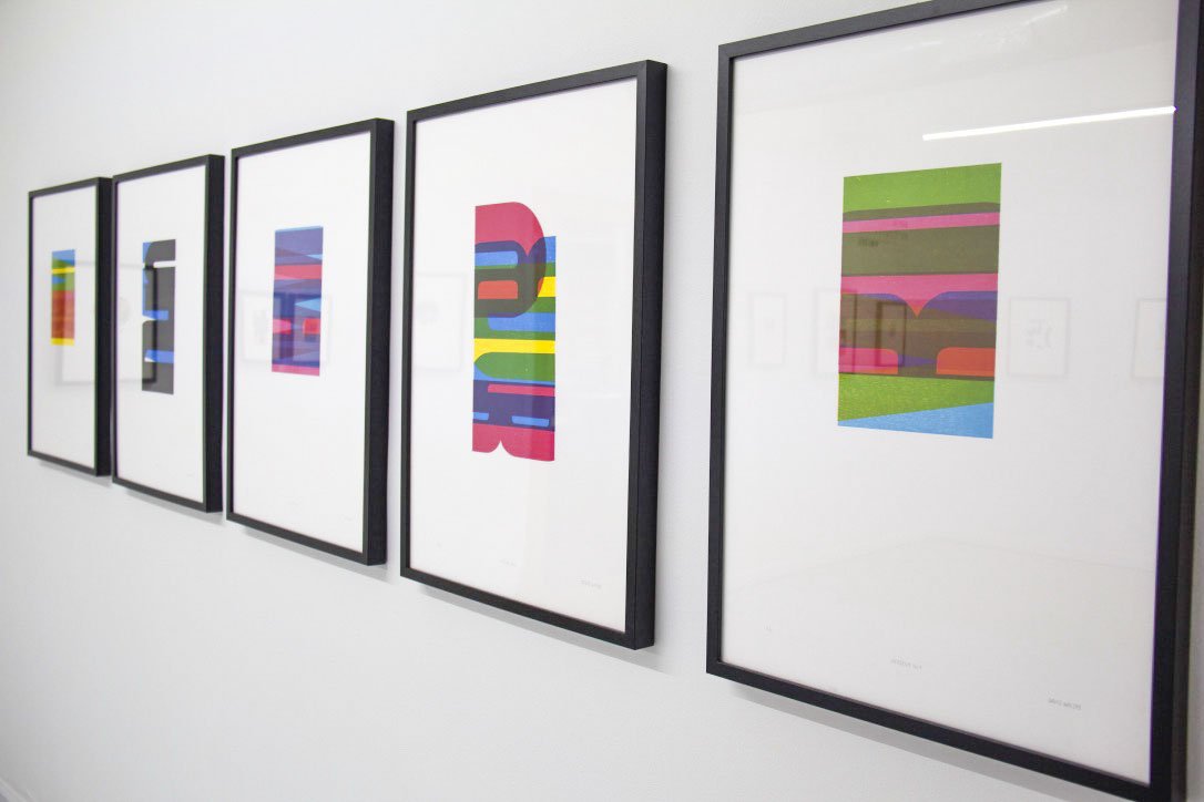
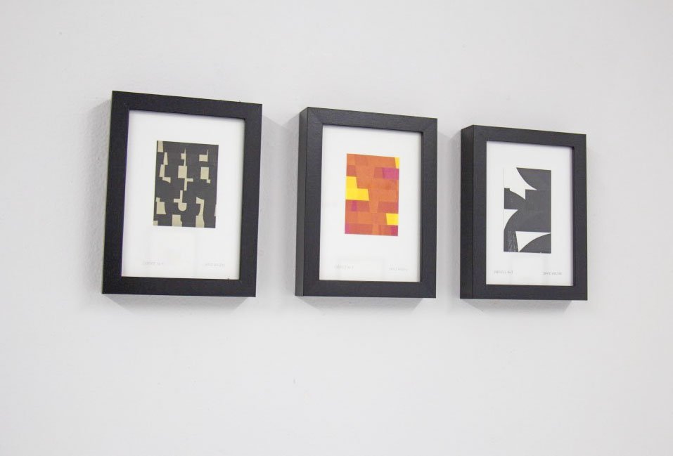
For example, the six large-scale prints spanning the Eastern wall in the gallery showcase a series that all result from using just four letters: W, O, R, D. For about three to four years, Wolske made four or five series of prints just using these letters. “I honestly believe I could keep making work for the rest of my life using just those four letterforms, but I do have some other interests.”


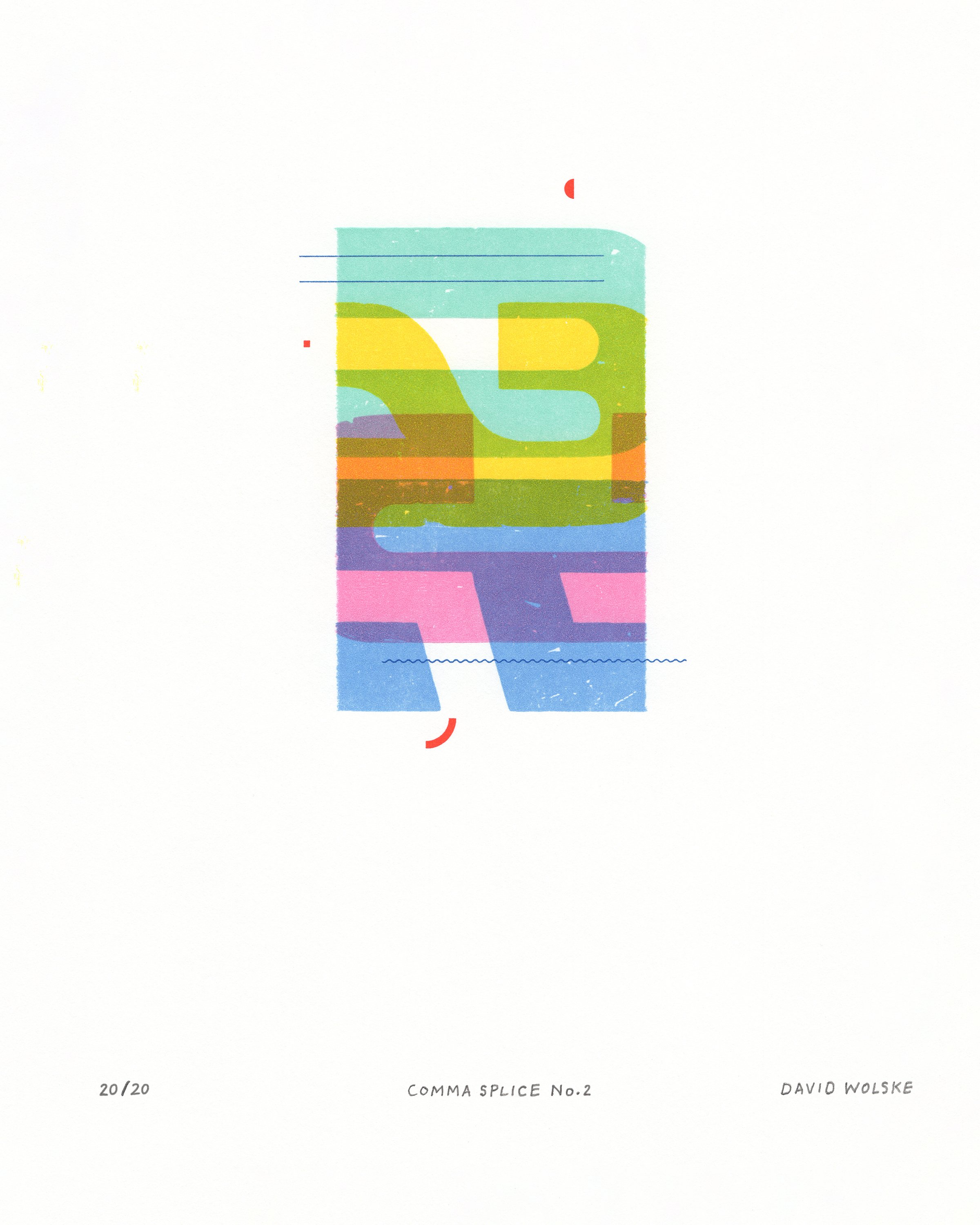
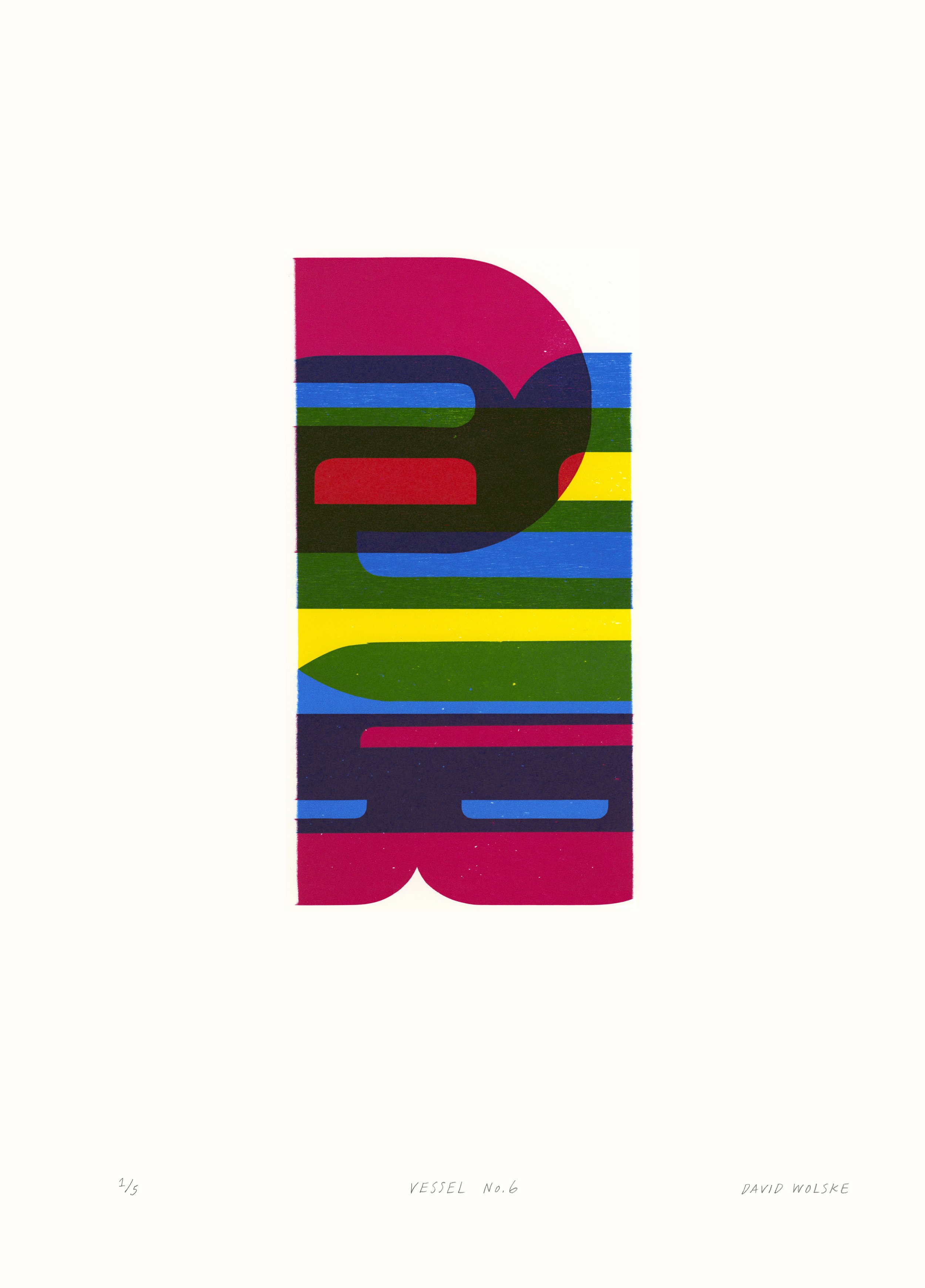
In Wolske’s second series of anagrams started in early 2021, he broadens his exploration to include the letters that make up the word, SPEAR. When recombined, these letters offer the most reconfigurations to make new words in the English language, and therefore, endless potential for Wolske to conjure new compositional and color arrangments in his work. These limitations get him excited about the possibilities which live within this framework. The same can be said for his limited color palette of CMYK, which offer infinite possibilities each time they’re layered.
“the more limitations placed on me, the more creative I feel. It gives me this friction to push against and I get really excited about seeing how far I can go and how many different combinations I can come up with.”
-David Wolske
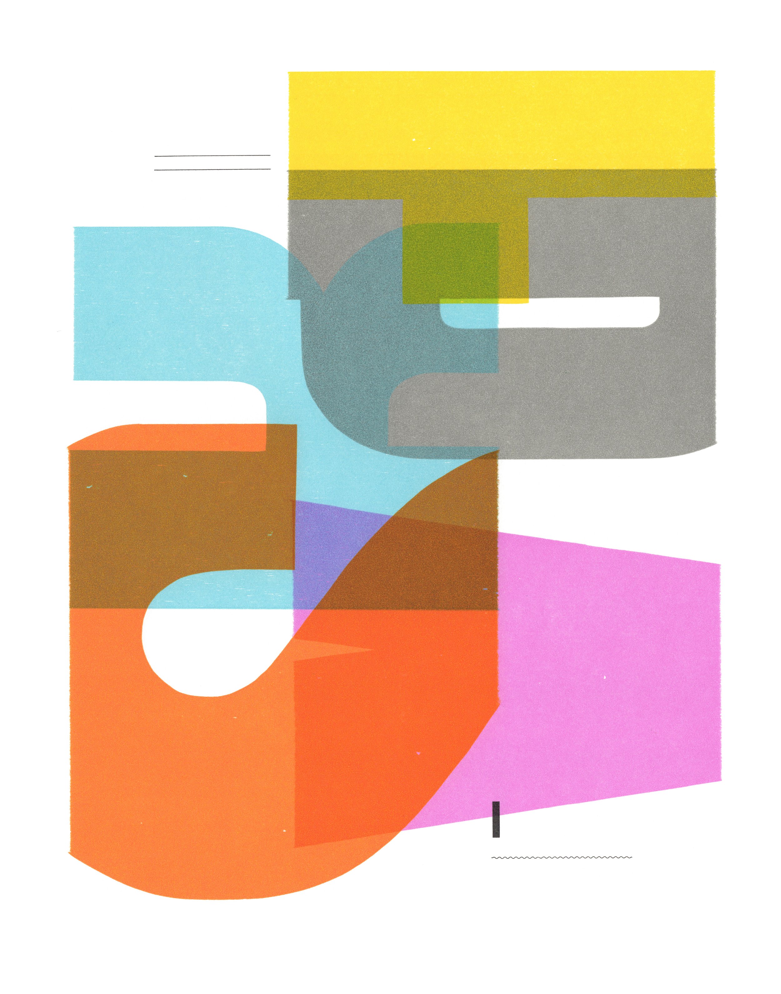
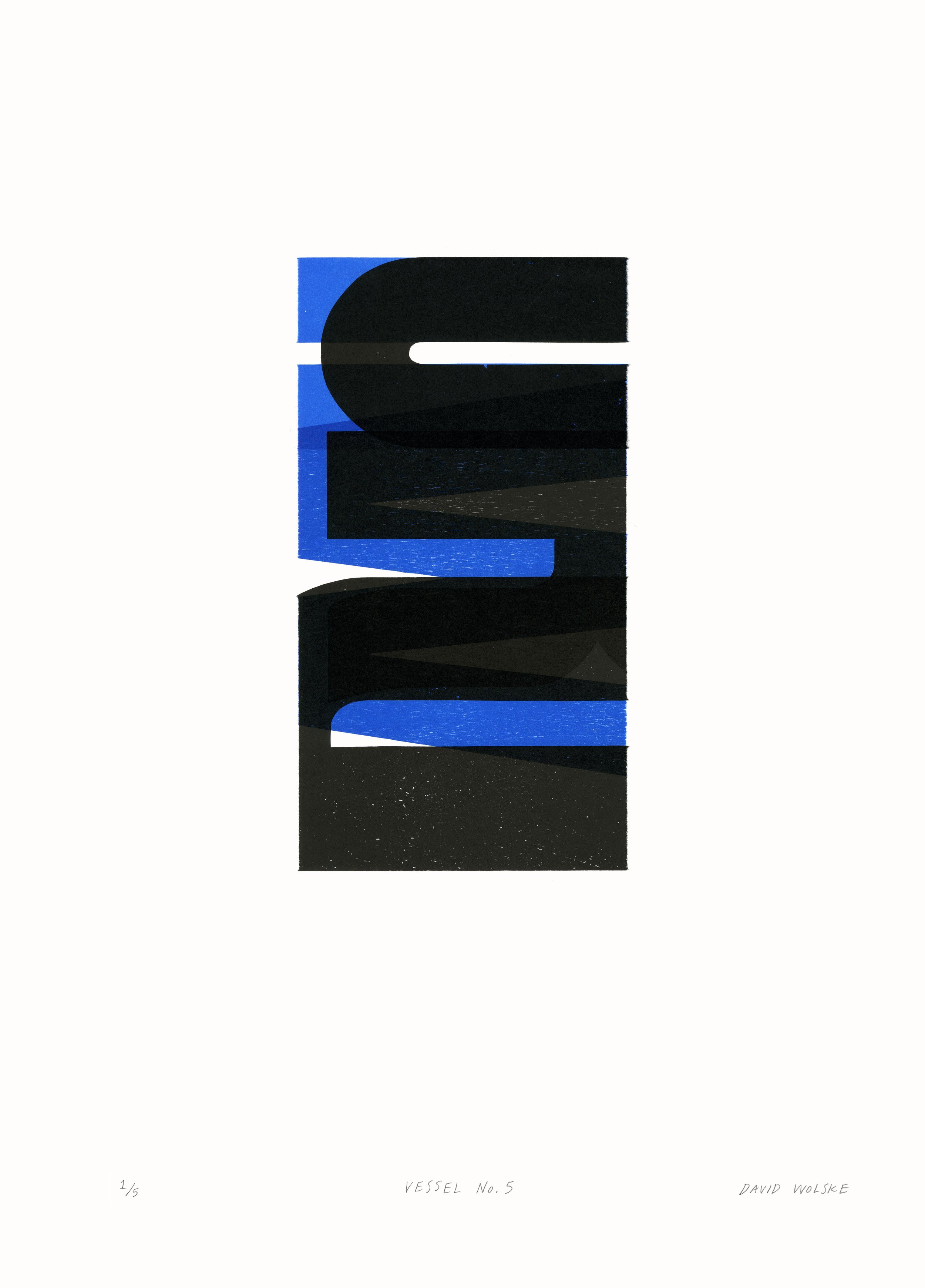
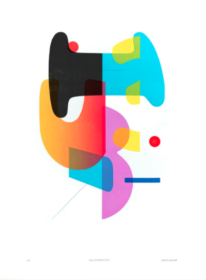
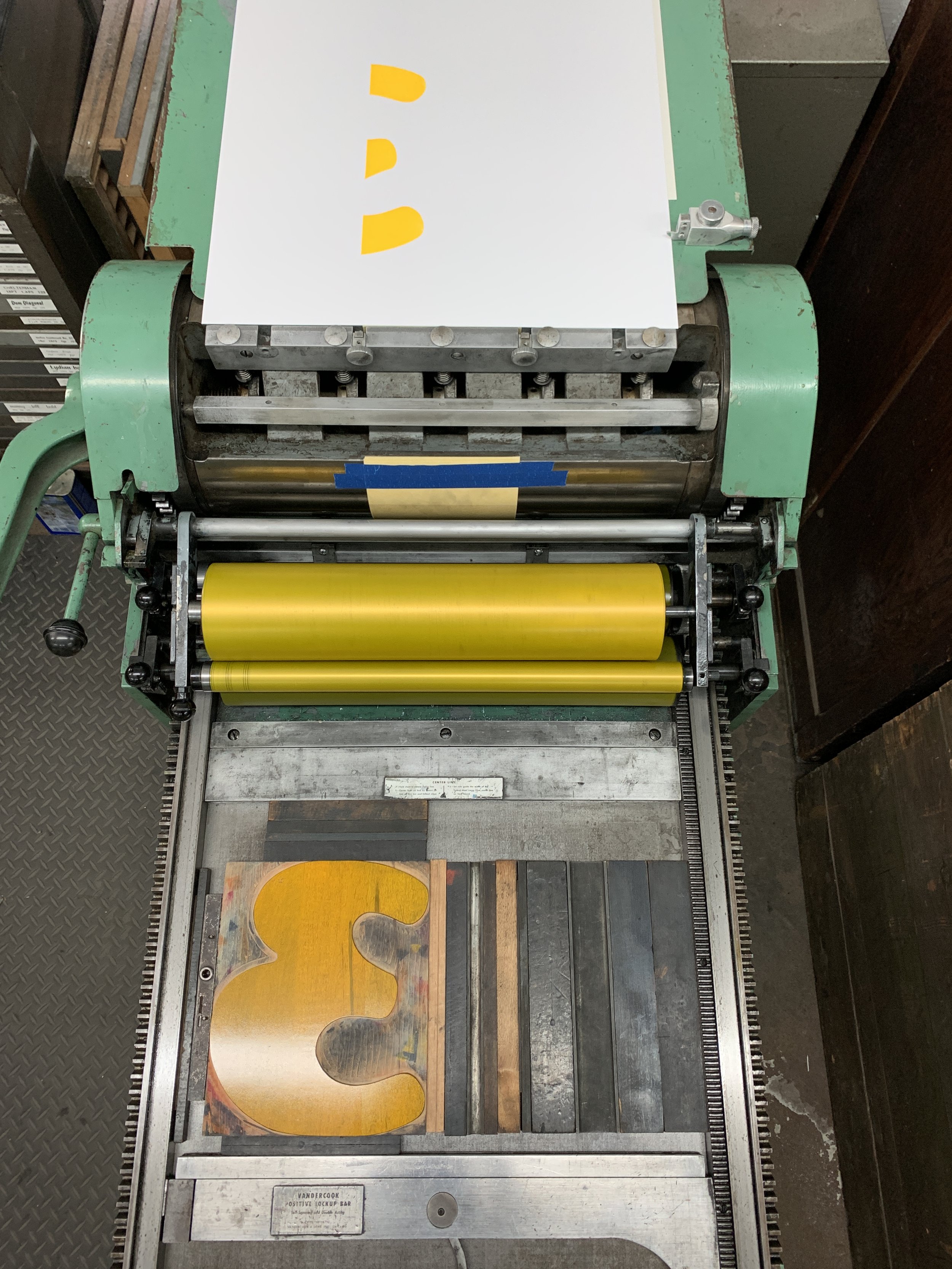
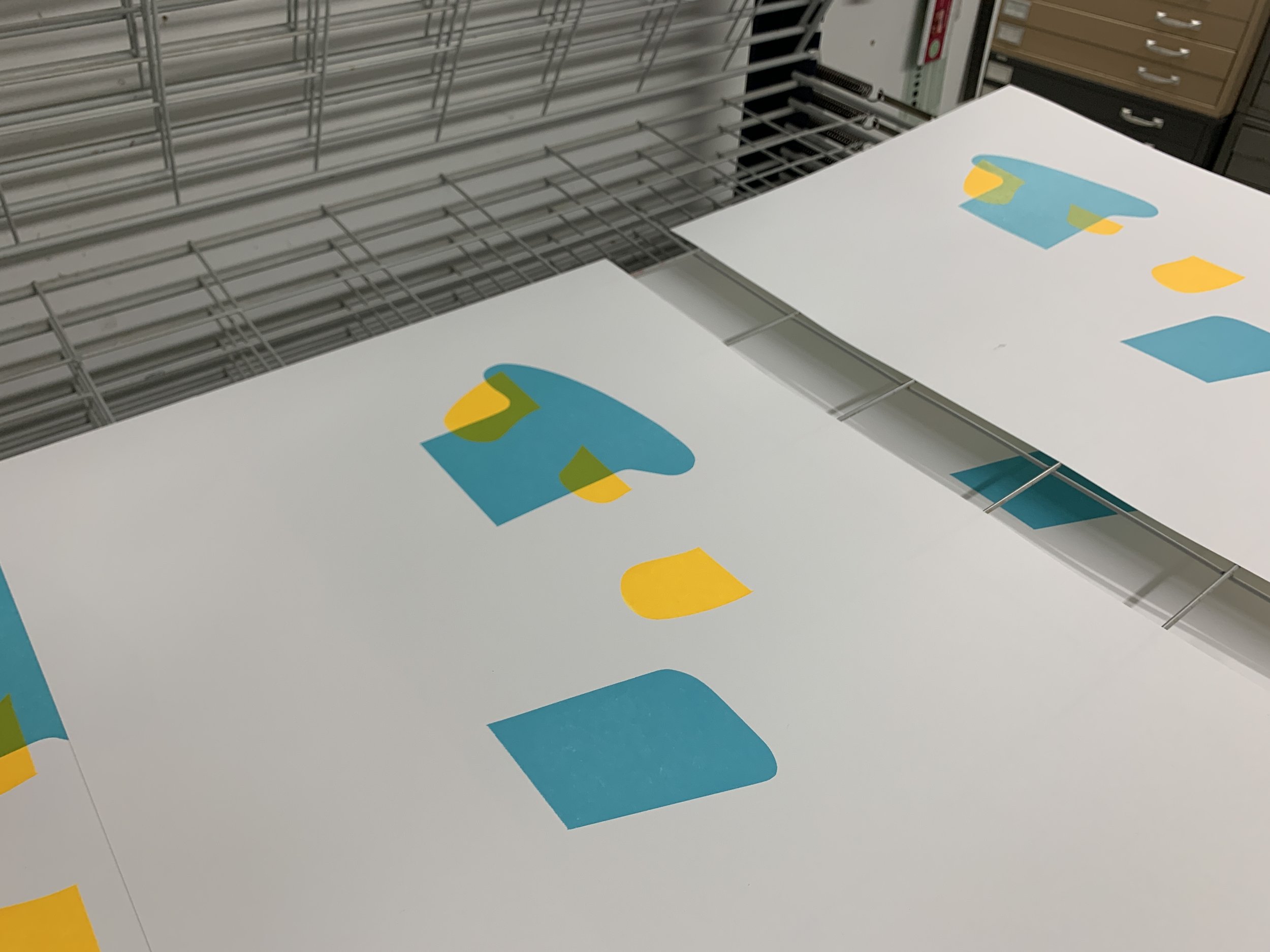
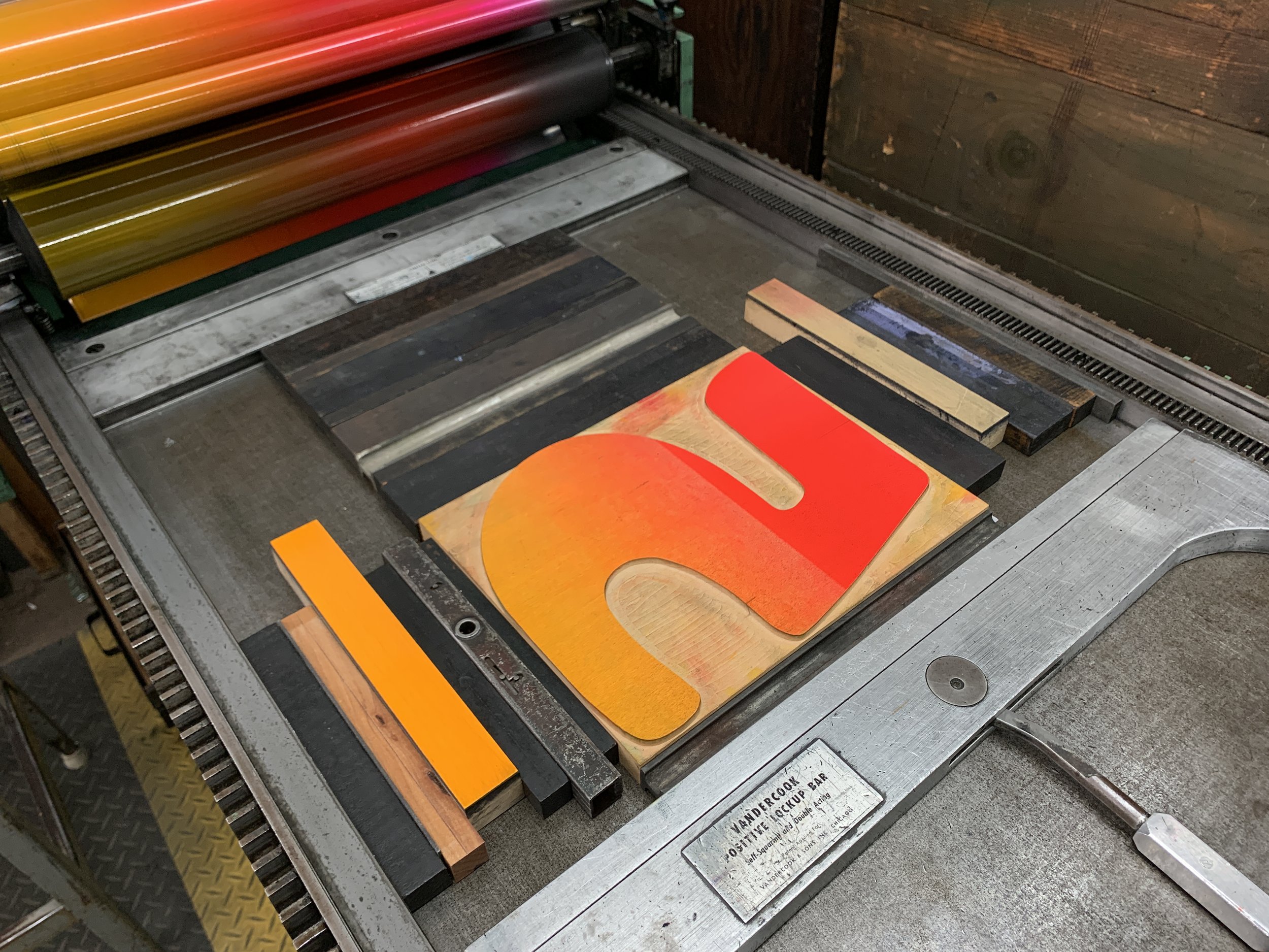
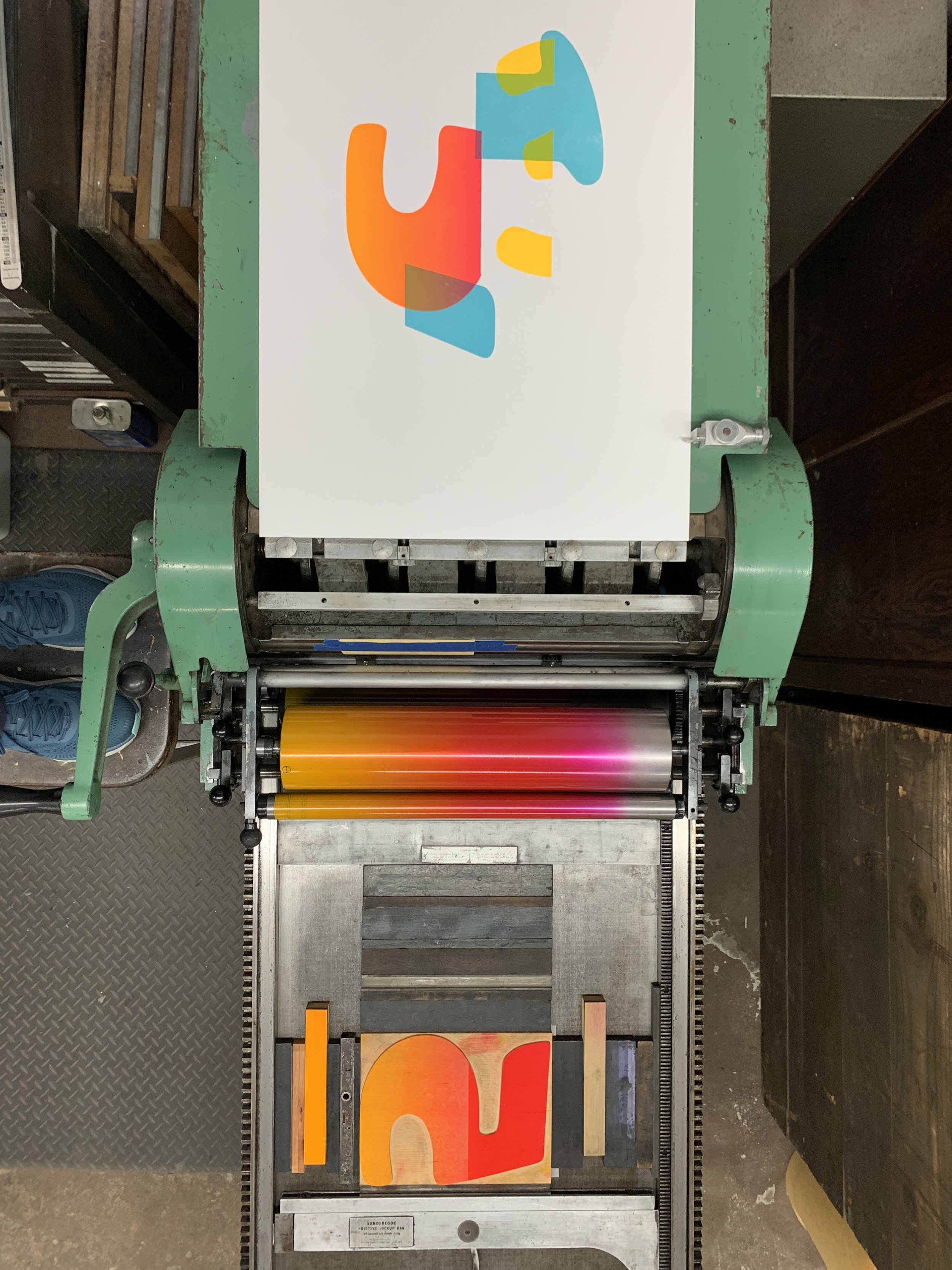
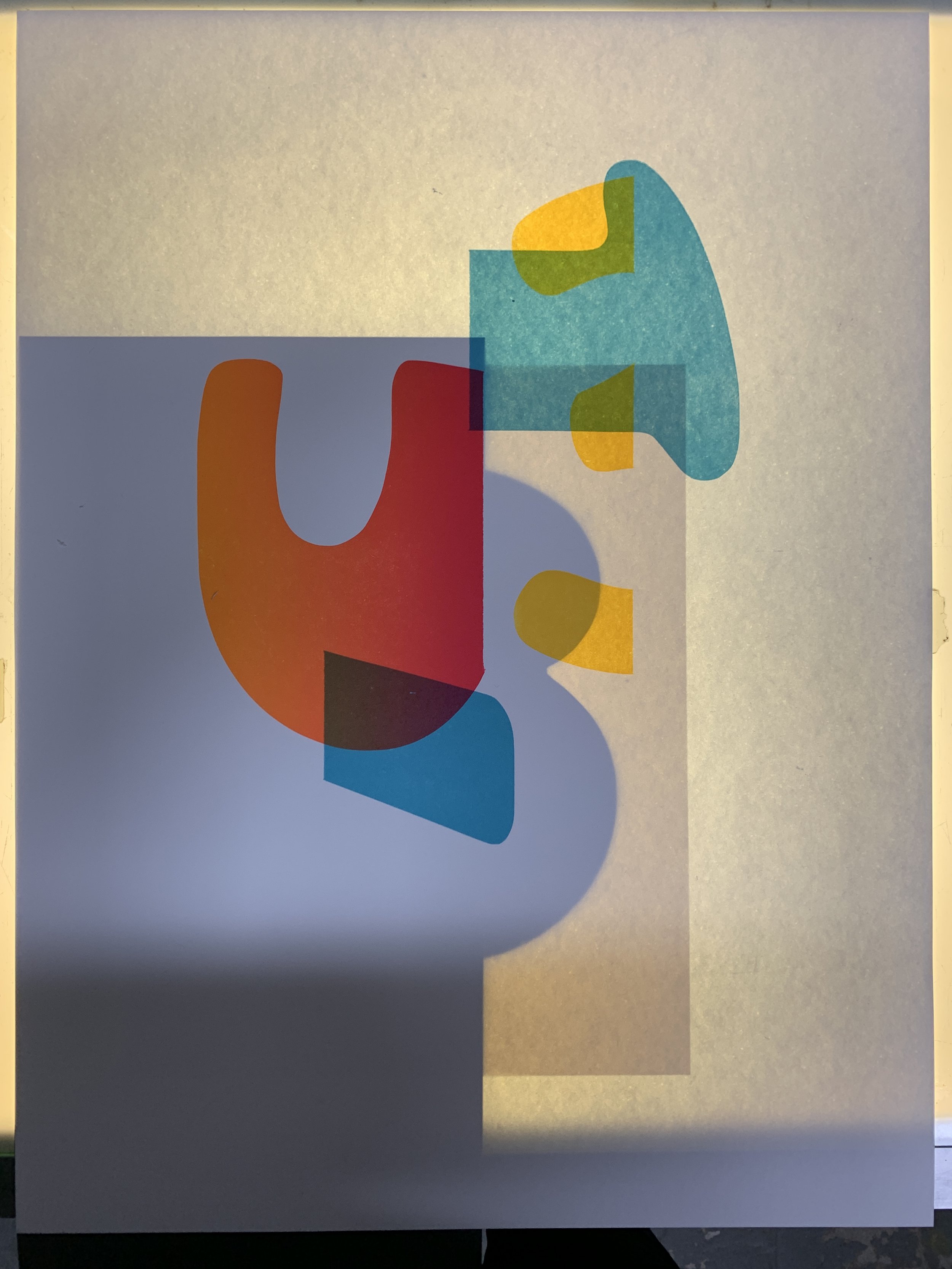
We’re happy to share David Wolske’s newest work with you, Polysynthesis No. 1, which resulted from a week-long residency at IS Projects. Printed in December 2021 during his Exhibiting Artist Residency, David found inspiration for his abstract composition “in the vibrant and abundant colors, textures, patterns, and personalities at IS Projects and in Fort Lauderdale”. While the cropped numbers are characteristic of Wolske’s experimental letterpress work, the use of rounder shapes, fluorescent inks and a gradient (aka split-fountain or rainbow roll) are exciting new additions to the artist’s unique visual vocabulary. David did all of the letterpress printing by hand using the studio’s Vandercook SP-20 and wood type from the Selikoff Collection. The edition of 12 is hand numbered and signed by the artist.

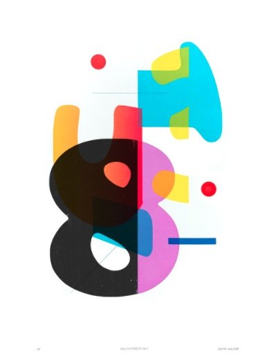
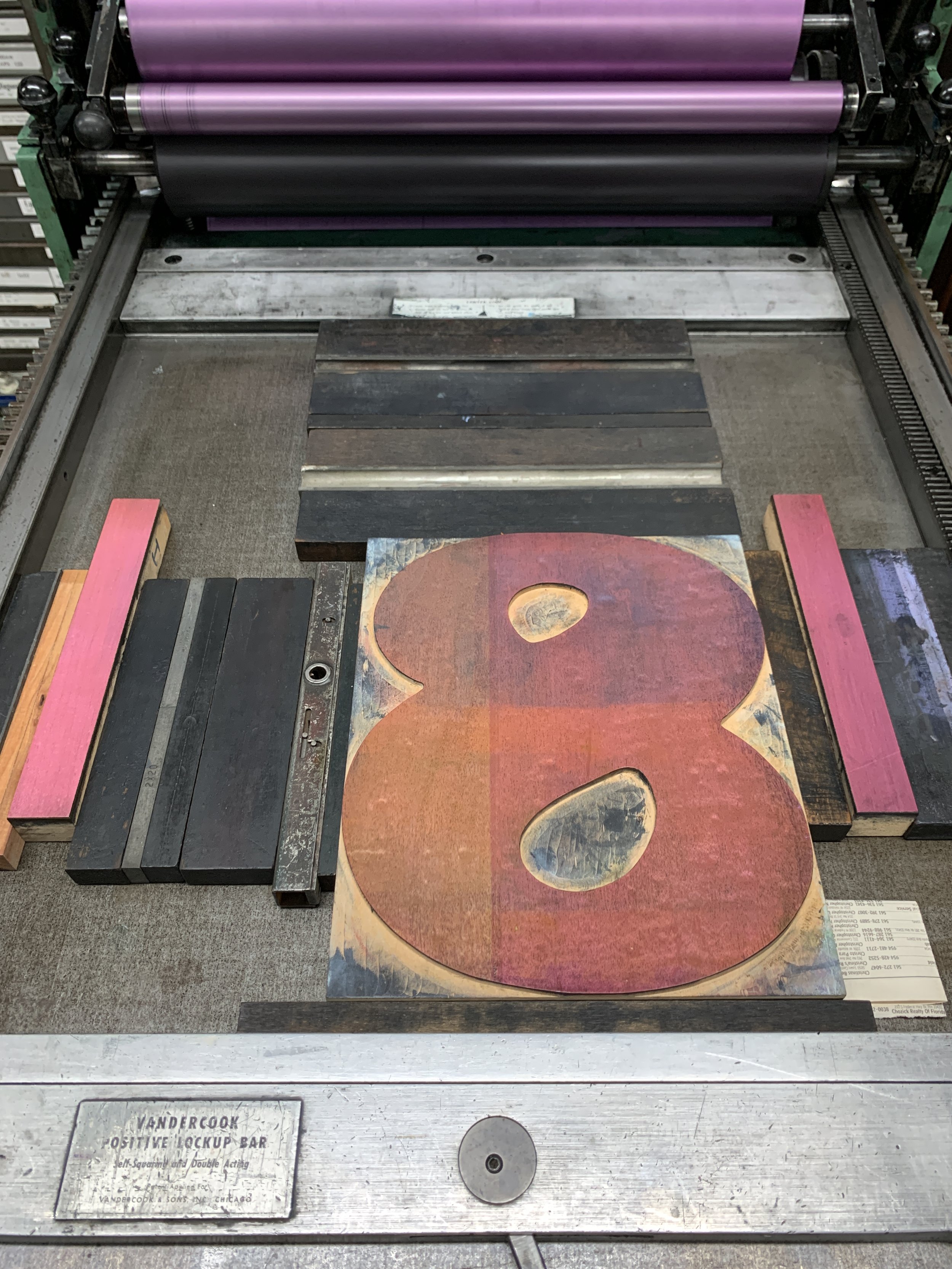
This special print prominently features 120 line Cooper Black wood type from our Selikoff Collection. These Cooper Black numbers were a sentimental staple from Vote For Letterpress, the print shop in New Jersey we acquired in 2018 after the untimely passing of designer and printer, Jon Selikoff from ALS. We aim to preserve Jon’s legacy at IS Projects through the Selikoff Collection by keeping his collection together and keeping his memory at the forefront of the conversations around the collection.

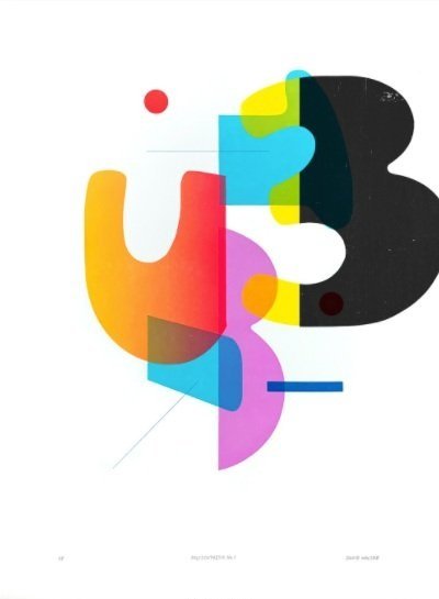
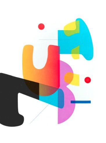
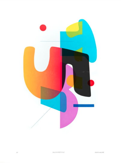
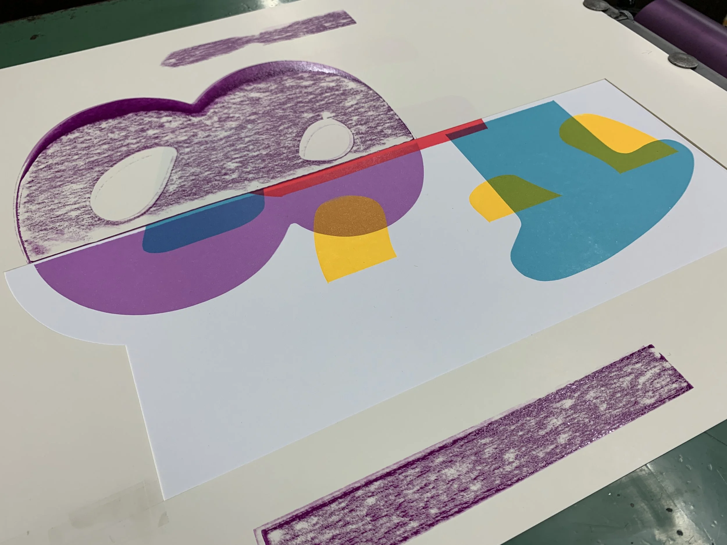
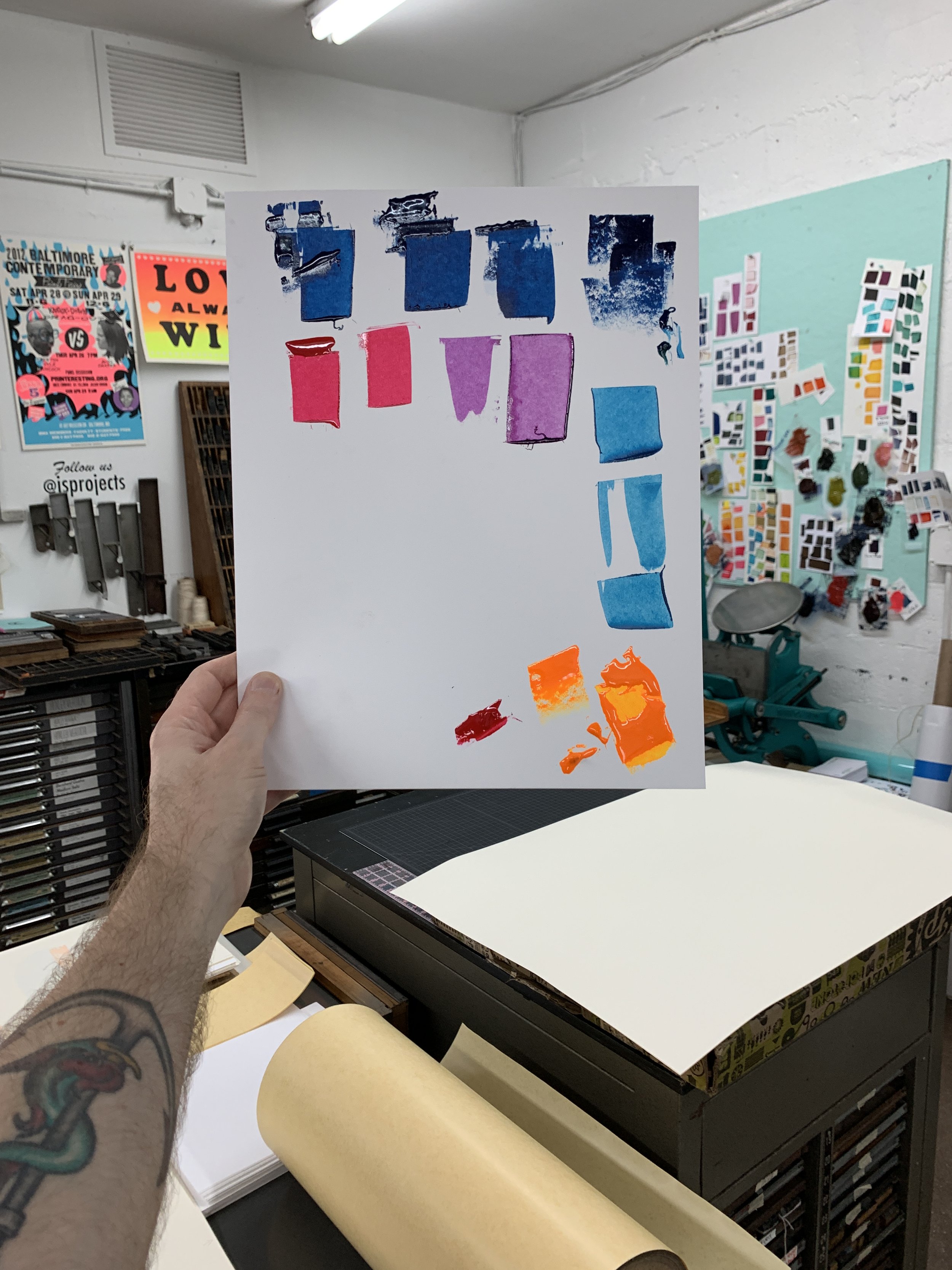
Having met Jon through a letterpress class David taught at the Hamilton Wood Type Museum in Two Rivers, WI, and remaining good friends with him throughout the years, Wolske was laser-focused on highlighting his friend’s beautiful type during the residency. Below is a small peek at how Cooper numbers were masked (demonstrated in black) to create the final edition and a gallery to illuminate some of David’s process.
While the exhibition came to a close early this month, we invite you to view the works more closely through our Virtual Gallery Tour. For more information on David Wolske and his work, visit his website.